
Learning Objective:
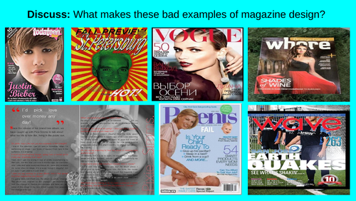
To identify a range of features on a magazine cover and evaluate the impact of the typography.
Target Audience:
This was aimed for a high ability Year 7/8 extended curriculum module but would also work for Year 9 or beginner GCSE Media students.
Overview:
It guides the students through the visual conventions of a magazine cover and introduces them to key Terminology:
- Connotations
- Denotations
- Typography
- Masthead
- Tertiary
- Analogous
- Chromatic
- Cover lines.
Additional Resources:
There are optional extra resources in the reading notes to extend certain activities and guide with teacher questioning.
Note:
I will be adding more to this series as I make them.
Some images have been taken from Google
Something went wrong, please try again later.
This resource hasn't been reviewed yet
To ensure quality for our reviews, only customers who have purchased this resource can review it
Report this resourceto let us know if it violates our terms and conditions.
Our customer service team will review your report and will be in touch.