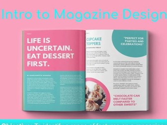
Introduction to Magazine Design
Learning Objective:
To identify a range of features on a magazine cover and evaluate the impact of the typography.
Target Audience:
This was aimed for a high ability Year 7/8 extended curriculum module but would also work for Year 9 or beginner GCSE Media students.
Overview:
It guides the students through the visual conventions of a magazine cover and introduces them to key Terminology:
Connotations
Denotations
Typography
Masthead
Tertiary
Analogous
Chromatic
Cover lines.
Additional Resources:
There are optional extra resources in the reading notes to extend certain activities and guide with teacher questioning.
Note:
I will be adding more to this series as I make them.
Some images have been taken from Google
