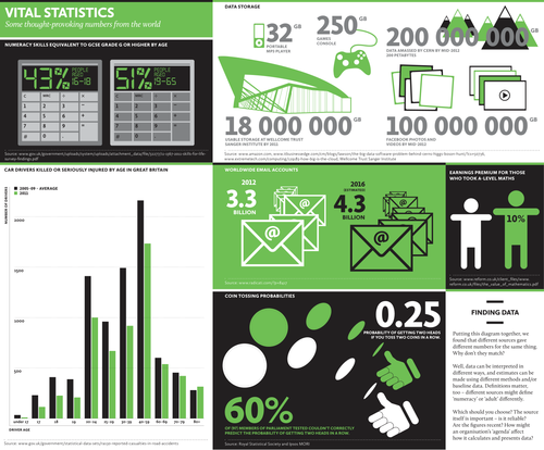
Use this diagram to show your students that different sources give different numbers for the same thing. Why don’t they match? Well, data can be interpreted in different ways, and estimates can be made using different methods and/or baseline data. Definitions matter, too – different sources might define ‘numeracy’ or ‘adult’ differently. Which should you choose? The source itself is important – is it reliable? Are the figures recent? How might an organisation’s ‘agenda’ affect how it calculates and presents data?
Something went wrong, please try again later.
A very nice infographic that would be excellent to generate discussion about statistics. Would be ideal to elicit some good questioning
Report this resourceto let us know if it violates our terms and conditions.
Our customer service team will review your report and will be in touch.
£0.00
