Scatter diagram
Lesson presentations and activities
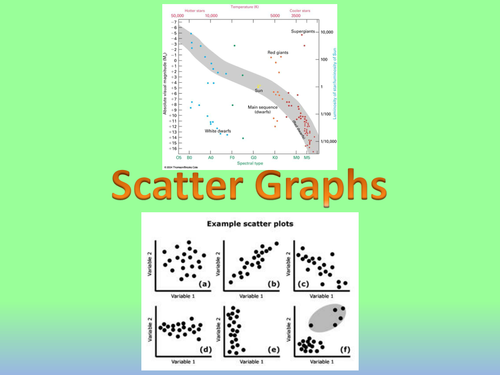
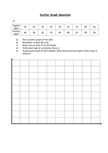
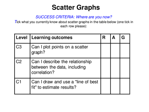
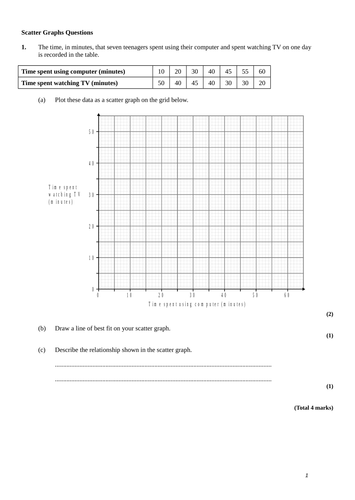
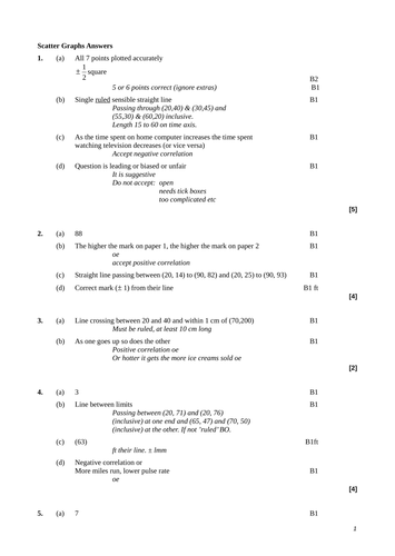
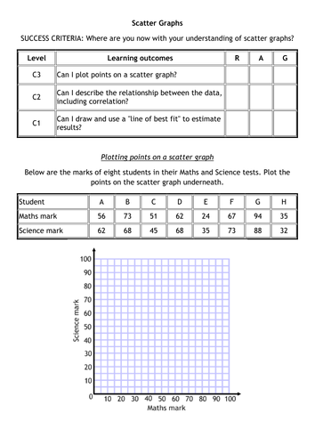
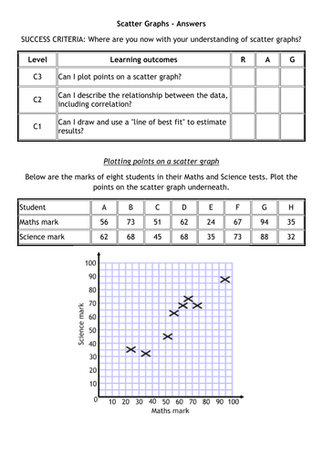
Powerpoint and worksheet on plotting Scatter Graphs, identifying correlation and using lines of best fit. The data on the sheet has come from somewhere else but I'm not sure exactly where from! You will need to write over some of the slides... If you like this resource then please check out my other stuff on here!
Reviews
shuklahetalb9 days ago
Thank you
Anwenshahim9 months ago
Great resource - saved me some preparation work- many thanks!
KEBDotty3 years ago
Thanks for sharing
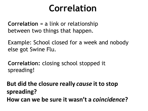
Introduction to the area of correlation and cause. Examples of correlations that imply causation and some that do not (due to a coincidence or third variable). Useful for 21st Century Science, particularly topic C1 - Air Quality.
Reviews
ColinByrne1014 years ago
Lovely set of slides, causes students to think and is also funny!
kbremer4 years ago
Great thank you for sharing
oread25 years ago
Lovely resource! Just downloaded it and the first slide made me giggle! a little bit too relevant!
Practice questions, homeworks and assessments
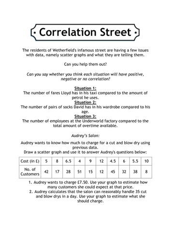
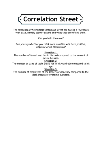
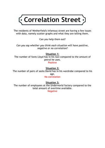
Help out the famous Wetherfield residents with their data issues by drawing and using scatter graphs.
Reviews
tr6rv6506 years ago
Superb! The little treasures should enjoy the corro link.
Many thanks for sharingTES Resource Team7 years ago
Thank you for publishing your resource. It has been selected to be featured in a new secondary maths collection.
angelica_jimenez7 years ago
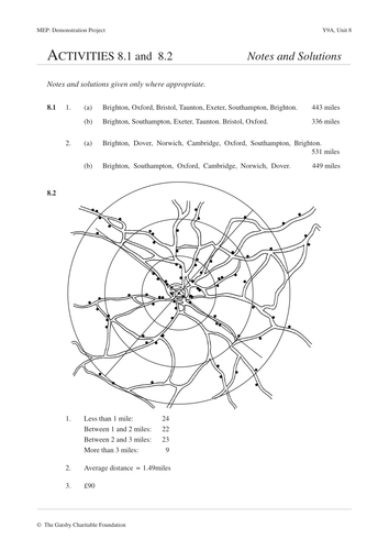
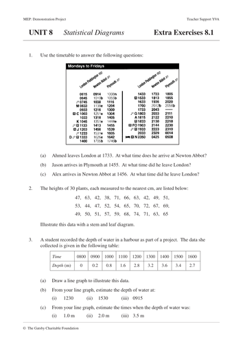
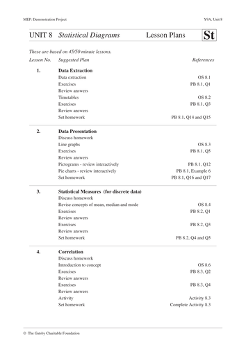
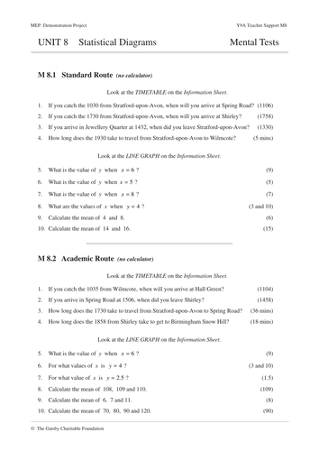
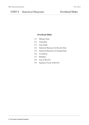
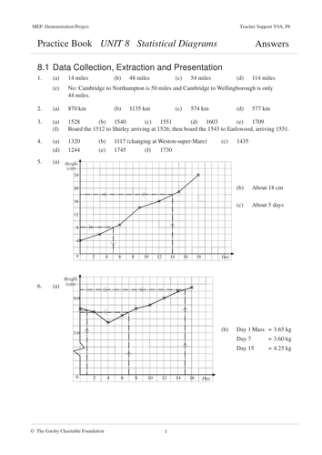
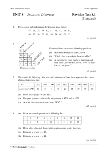
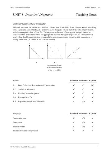
Worksheets and lesson plans on representing data. The topic of Statistical Diagrams from the Year 9 book of the Mathematics Enhancement Program. For information about these resources and an index for the whole collection please visit http://www.mrbartonmaths.com/CIMT.htm Keywords: Questionnaire, Analysis, Question, Biased, Unbiased, Design, Leading, Line Graph, Bar Chart, Process, Display, Conclude, Evidence, Sample, Survey, Multiple Choice, Pilot, Study, Hypothesis, Trend, Bar Chart, Pie Chart, Line Graph, Presentation, Data
Reviews
brownrex5 years ago
Very useful. Many Thanks
kabertoss5 years ago
kiranjha5 years ago
This is just a lesson on scatter graphs that I wanted so that I could just hand out one booklet and then teach the class without the faff of them drawing axes etc. It goes from simple plotting to describing correlation to using a 'line of best fit'. Two sets of questions depending on which Key Stage you are teaching.
Reviews
davegolda year ago
Awesome! Many thanks.
jurgladerach2 years ago
Thank you!
rosiepeat3 years ago
Fantastic resource!
Great for Revision. True/false sorting activity (10 statements about best-fit lines to target misconceptions / deepen understanding) with accompanying ppt on scatter graphs. Plus set of simple, clear graphs/description posters showing different types of correlation (for class questioning assessment / matching activity / display).
Reviews
Anon329481320696260244 years ago
I'm using this with a year 8 class as part of their numerical skills refresher. It is working well.
tr6rv6505 years ago
Thanks for sharing
Eliza_and_Co6 years ago


