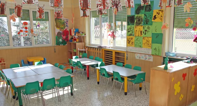
The word “displays” for me evokes memories of my NQT year. Sugar paper, those wavy borders that come in all of the primary colours (plus purple) and the staple gun. Happy times.
The time spent trying to back the boards with something other than obscene graffiti about my beloved subject, however, is a less pleasant memory perhaps.
Read more: How a SEND diagnosis affects teachers’ judgement
From the magazine: Does positive education improve results?
Listen: John Hattie takes on his Visible Learning critics
Displays are great in that they allow a teacher to bring their own touches and personality to a classroom.
However, it is important not to go too overboard and consider your pupils’ cognitive load to ensure your displays are centred on learning.
1. Keep it simple
Creating a good learning environment should not cost you time. In fact, keeping it simple and clear is key. Fisher (2014) found that students are less likely to stay focused in a highly decorated classroom and received lower test scores than those taught in a sparsely decorated room.
With this in mind, to reduce workload, plan your displays carefully and ensure that every part of the classroom displays serves a function.
2. Make resources clear
When thinking about displays, make them clear. Don’t plaster your walls with random words, hang things from the ceiling and generally make the room look like a maze of paper. Taking this approach will cost you time and may impact on your teaching efficiency.
Make your room a 360-degree experience, but group resources together. Key terms in one place, writing frames in another and exemplars in another. Keep the cognitive load low though by guiding students around the displays.
3. Make them memorable
Make them a resource that you refer to in your teaching and keep referring to them. Use your room to guide your kids through their exam: key words/vocabulary, phrases, concepts, graphs, pictures, models of work with annotations.
Don’t just have your displays as static resources though. Remove terms and resources and use the gaps for recall exercises. Build in low stakes testing around your displays and most of all replicate them (if you can) so that students can use them at home.
Something I find that works really well is printing off part of your display and setting exercises that encourage students to use the printed display resource as scaffolding. Application of a key paragraph structure is a lot easier if you’re using the same resources you see in class and it helps build an understanding of how important it is to be consistent in their approach.
Little tricks like this are a great way to build engagement with resources that take you time to make. Anything you can do to get more mileage and usage out of the things you’ve ploughed time into, the more valuable those resources become.
4. Share the load
Of course, displays can come at a price - financially and time-wise. Spread the load between members of the department for a shared approach.
Not only does this benefit teachers it helps students build a commonality of language across their years within your department.
This, in turn, reduces the workload of teachers each time they pick up a new class.
Adam Riches is a specialist leader in education and lead teacher in English


