- Home
- Could using this font improve learning?
Could using this font improve learning?

How do you create worksheets for your class that are truly memorable? While we might reach for zany colours and cartoons, research just published by RMIT University in Melbourne suggests that we need to give more thought to typefaces. To not put too fine a point on it: if you get the font wrong, you might be creating something that is frankly forgettable.
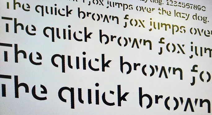
Type designers at RMIT have worked with psychologists to try to understand how the look of printed text can affect how well it is remembered. From this work, they have come up with “Sans Forgetica”, a new typeface that uses psychological and design theory to optimise retention.
A study of 400 students found that replacing plain Arial with Sans Forgetica saw a 7 per cent rise in how much of the text they could remember, creating a “terrific tool for students studying for exams”.
The typeface is as striking as the findings themselves. Slanting backwards, and with gaps slashing through each letter, it looks like a discarded design idea for the branding of the London Olympics. All of this is deliberate. According to Stephen Banham, the design lecturer who led the work, Sans Forgetica improves recall because “the mind will naturally seek to complete those shapes and so by doing that it slows the reading and triggers memory.”
As senior lecturer Janneke Blijlevens put it, this ability of the font to slow down our reading a little introduces some “desirable difficulty”. It is this concept that is perhaps the most striking for educators.
“When we want to learn something and remember it,” Blijlevens continues, “it’s good to have a little bit of an obstruction added to that learning process because if something is too easy it doesn’t create a memory trace.” Clearly, if something is simply too hard or unintelligible, there will be no functional trace left either, so “desirable difficulty” is a kind of sweet spot for retention.
Two things seem pertinent here. Firstly, when we are designing documents are we paying enough attention to the power of type? Those in the professional graphic design world live and die on their ability to make type memorable, to use its forms to create a strong impression. It seems that schools could learn from this. The ubiquity of Comic Sans in primary schools (not to mention countless resources in the Tes resource bank) is perhaps because teachers are trying to “sweeten” learning by making it look…comic. But what if the price being paid for saccharine easy digestion is a lack of lasting substance? What if our lovely worksheets end up, like candy floss, collapsing into very little that lasts?
Researchers at RMIT warn against setting long texts in Sans Forgetica because “it would likely give you a headache”, but some reflection on the ways we are presenting text is certainly worth it. When we are forced to slow down our brains have to work harder. The pathways they then plough are deeper, and better memory structures are created, leading to improved retention.
In my own practice, I have actually increased the amount that I ask students to write down. This has to be done appropriately, with consideration to those with specific learning needs, but because writing is neurologically a heavy load, it helps children remember things far better than simply handing them a pre-written sheet and asking them to read it. “Show your workings!” I keep telling them, not simply so they can go back and see how a problem was solved, but because writing things down strengthens recall.
“Desirable difficulty” is, then, perhaps a touchstone for our wider practice. When children have to think - really think - they not only end up understanding more, but sustain that understanding for a longer time. It can be tempting to try to smooth out every possible lump in the road to GCSEs and A-Levels. We slave away to make things easy for our students, but - this research suggests - we could be doing something counterproductive. Instead, we should be seeking for that sweet spot of “desirable difficulty”, where the challenge to think actually helps create a truly “memorable” lesson.
Kester Brewin teaches mathematics in south-east London. While working as a teacher, he has been a consultant for BBC Education, and is the author of a number of books on culture and religion. He tweets as @kesterbrewin
Sans Forgetica can be downloaded for free here.
Register with Tes and you can read two free articles every month plus you'll have access to our range of award-winning newsletters.
Keep reading with our special offer!
You’ve reached your limit of free articles this month.
- Unlimited access to all Tes magazine content
- Save your favourite articles and gift them to your colleagues
- Exclusive subscriber-only stories
- Over 200,000 archived articles
- Unlimited access to all Tes magazine content
- Save your favourite articles and gift them to your colleagues
- Exclusive subscriber-only stories
- Over 200,000 archived articles


