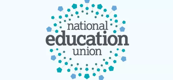
The ATL and NUT teaching unions have selected the logo for their new super union.
Tes can reveal that a logo called “together for education” has been chosen for the National Education Union, which will come into existence and be the largest education union in Europe when the ATL and NUT merge in September.
Victoria Barlow, ATL’s assistant general secretary of communications, said the logo was the “out-and-out favourite” when the unions consulted their members.
She said: “More than 10,315 members answered our survey on the NEU’s brand themes, giving a great deal of thought and helpful feedback about what they liked and how they’d want to see the initial logo idea develop.
“Unusually for a branding exercise, there was one option which came out as an out-and-out favourite, which we’ve named ‘together for education’.
“This logo ranked very well across all members - especially among new professionals with 73 per cent of trainees and 65 per cent of [newly qualified teachers] picking the design as their favourite.
“There was also clear support among our leaders and managers, with 50 per cent choosing the theme as their top preference.”
Members highlighted the logo’s “bright, positive design” and felt it captured “the sense of unity and growth across education and across the union,” she said.
A slideshow prepared by the unions’ brand consultants, Spencer du Bois, shared with Tes, includes comments from union members on the winning design.
One member said the “circular and interconnected branches” of the logo gave the idea of “collaboration and strength in numbers”.
“Like the concept of education at the heart, a circle representing support all around and community,” commented another.
A third member said: “grabs the eye better and the pentagons reflect that everyone is important”.
On Tuesday Tes exclusively revealed the four draft logos which were being considered for the NEU.
Writing for Tes, design critic Hugh Pearman picked out the “together for education” logo as the “clear winner”. He said it was “outward-facing” and optimistic”, and thought highly of its “soothing” blue and green colours.
The design was also the pick of Tes readers. In a Twitter poll of 354 people, 56 per cent backed the design.
The next most popular was design ‘A’, dubbed by Mr Pearson as the “Hitchcockian vortex-of-doom” (22 per cent), followed by design ‘C’ (19 per cent), which Mr Pearson described as “absolutely terrible”.
Design ‘B’, which he said looked like “an old-fashioned building society brand”, scraped only 3 per cent of votes.
Ms Barlow said the successful design was not the final logo. “Our next steps will be to take our members’ considered feedback to develop the logo, messaging and materials ready for the NEU’s launch on 1 September,” she said.


