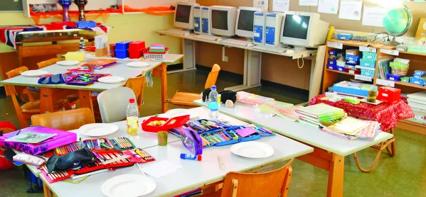
You’re a film-set designer. You’ve been asked to create a classroom. What do you do?
Naturally you start with pale walls, adorned with a repetitive grid of A4-sized work, presumably done by the students. You then include some shelving with a stack of tedious textbooks, and throw in a generic poster that’s been sold in HMV for the past 10 years.
Unfortunately, this is an all-too-familiar sight for schoolchildren around the country. I certainly didn’t have to imagine too hard when writing the above paragraph.
A few months ago, TES reported on a study suggesting that it may be better for children’s learning if they work in a neutral, uncluttered classroom - something even more boring than the typical classroom I have described (bit.ly/ClassDisplays).
Having recently left school, I can tell you that this is the very opposite of what encouraged me to learn. I say that teachers should not only embrace the cluttered classroom but go out of their way to ensure their room is filled with objects that have little relevance to the subject at hand.
Model guillotines are a cut above
One of my favourite classes at school was history. Yes, I was interested in the subject and, yes, the teacher was very good, but the unique aspect of the lessons was the classroom. It was decorated from top to bottom, but what made it stand out was the fact that most of the items on display were irrelevant.
My teacher projected his own interests on to his workspace, some of which were historical but most were not: souvenirs picked up abroad; photos of past school trips; comic book covers; flags; Star Wars figurines; posters of his favourite shows; a selection of the best models made by previous students (including a working guillotine). It was an Aladdin’s cave.
Teachers must be allowed to make their classrooms their own. To do this, they should focus on creating the environment they would like to work in, rather than the environment they think students would like to work in.
Call me heartless, call me self-centred, but at school I really didn’t care about the “diary entry of a Victorian worker” written by William from Year 8 on the wall, and I doubt that the majority of the other students in the room cared either.
The personal touch
Instead of students’ work, what I much preferred to see was something representing the teacher’s personal interests. This set them apart as an individual, creating an environment that was truly theirs and welcoming students into a unique place of learning. Such an approach humanises a teacher, demonstrates that they have a life and character outside the classroom, and encourages students to engage with them as a person, creating a much better connection that leads to more effective teaching.
This is an edited version of an article in the 9 October edition of TES. To read the full article, subscribe to TES
Other teachers had different ways of making a classroom their own. One geography teacher - another favourite at the school - didn’t have his own room but would begin each lesson by playing music and videos as the students came in. These often revolved around wordplay based on the theme of the lesson. Who wouldn’t be up for learning about the territorial conflict between Pakistan and India after entering the room to a soundtrack of Led Zeppelin’s Kashmir?
It could be argued, rightly, that students’ work deserves a place on the walls. However, that space should be reserved for particularly outstanding and captivating pieces, which encourage others and create a better classroom. A secondary school shouldn’t patronise pupils by placing everything ever written on its walls; this devalues the genuinely impressive efforts. And a guillotine is far cooler than a diary entry anyway.
Dominic Pollard is in his third year at Durham University studying ancient history. To keep up with the latest education news and opinion, follow TES on Twitter and like TES on Facebook


