


Recent
Most read

Despite it being widely considered as a gift to dyslexic students in the classroom, people outside of schools don’t like Comic Sans much. If you want to know how much they dislike it, just look at tumblr.
When you type in Comic Sans you get pages like “Fuck no Comic Sans”, which has racked up more than 11,000 likes. And you get “Comic Sans ruins everything”. And you get “Comic Sans must die”.
It’s an angry place.
And when it comes to Comic Sans, the anger is not just directed at the font*, but at those who use it, those who keep it alive, those who “should know better”, those like you.
For it is teachers, says the anti-Comic Sans narrative, who are muck-spraying Comic Sans on society, who are leading poor font-novices into a world of sin, and who are dismantling the beauty of the world one worksheet at a time (don’t even get the haters started on display boards...).
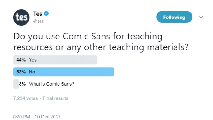
This claim of teacher responsibility appears to be a valid one. You can’t escape Comic Sans in schools: a Tes survey of more than 7,000 teachers found that 44 per cent were using it in their classrooms (both primary and secondary).
Their defence? Mainly, as above, they believe it is better than any other font for dyslexic students. But they also think it is better for reading, better for dyslexic students and better for modelling handwriting.
And some just think it looks nice.
The last is a matter of taste, but the first three responses, they sound like good reasons for a teacher to pick a font. But are those benefits actually real?
To find out, let’s take a typographic journey. Let’s find the truth about Comic Sans. I can promise you clarity but also, I can promise more: we may well also discover some of the secrets of the mechanics of reading that will benefit us all.
You have to feel sorry for Vincent Connare. In 1994, he was asked to design a font for a Microsoft product called Microsoft Bob, a cartoon dog that would guide you around the Windows operating system via speech bubbles.
Connare thought a comic-book-style font would suit a comic-book-style dog, and designed Comic Sans. Microsoft seemingly disagreed (or did not have time to incorporate it into the product - depending on which narrative you read) and launched Bob without Comic Sans. But it did list Comic Sans as a font choice in Windows 95.
And that has brought Connare a lot of hassle.
For though Comic Sans is widely cited as one of the most used fonts on the planet, it is also one of the most vilified. Designers, in particular, detest it. Connare, a designer, has been lambasted by his own kin. And by plenty of others, too.
But as you can see from the video from Wired magazine below, he’s far from disowning it.
Quite why the font attracts such ire is difficult to understand, but that it does is unquestionable.
Except in schools: nowhere is Comic Sans more eagerly embraced and defended than in education. And over the years the justifications for its use have grown more serious. Where once it may have simply looked ‘fun’ (and why not pick a fun font?), now it is credited as having huge benefits for dyslexic readers, for handwriting, and for reading in general.
Was there any proof of these benefits? Right, I thought, I’ll find out.
And almost immediately I hit a problem.
A clear research picture is tricky because researchers look at the relationship between fonts and reading from two different starting points, says Dr Eva Marinus, senior research fellow in the department for cognitive science at Macquarie University, Australia.
“When considering the literature on fonts, I think it is important to bear in mind the background of who conducted the study,” she explains.
“On the one hand, there are typography researchers who have produced quite a body of research focusing on subjective font preferences and aesthetics of text presentation.
“On the other hand, there are cognitive psychology/education researchers who tend to focus on the underlying processes that might explain why certain fonts are easier to read/better for beginning readers and children with reading difficulties.”
The problem, she says, is that the two groups of researchers rarely work together.
“I think it would be good if researchers from both fields would combine their forces to get some more clarity about the impact of different aspects of font,” says Marinus.
So what do the two fields say?
Let’s take the typographic set (geddit?) first.
In this field, everyone points you towards Professor Sue Walker, of the typography and graphic communication department at the University of Reading.
Walker has been researching typography in school and childhood reading materials for many years. Her work with KS1 emerging readers suggests children can read sans-serif and serif fonts equally well. And that, by and large, font choice - if we refer to font as the shape and style of the letters - had a minimal impact statistically on how well most children in her study read.
She also says that the argument for using Comic Sans based on it having the rounded ‘a’ or ‘g’ is not backed by evidence.
“The kids I talked with had no problems with different forms of ‘a’ and ‘g’ (but teachers tend to think that single-storey a and g is better),” she says.
She cites evidence in her book, The songs the letters sing: typography and children’s reading, that found the same.
What she will say is that there are some attributes of typefaces that definitely do not benefit children’s reading.
“Typefaces with very short ascenders and descenders [the up and down lines on a ‘b’ and a ‘’p’, for example] is one example, and another is those with very round or geometric letterforms, which are likely to reinforce similarities between confusable characters such as a, g and o,” she says.
But she also stresses that not only letter shape is important when it comes to reading.
“Bottom line, in my view, is that space between lines and words - and length of line - are more relevant than typeface,” she says.
So there is nothing to suggest Comic Sans is any better than any other font, in terms of letter shape, so far.
But what about the other field of research? Do those academics have its back?
In this field, most studies focus on dyslexia. As readability for dyslexic students was the chief reason for teachers saying they used Comic Sans, this is handy.
Professor Maggie Snowling, president of St John’s College at the University of Oxford, is to dyslexia research what Walker is to typography in children’s reading materials - everyone says to ask her first (you can hear her talk extensively about dyslexia and education in the Tes Podagogy podcast below).
So does she know of any research that suggests Comic Sans should be the font of choice for dyslexic students?
Her reply was to the point: “I don’t know of any serious work on this issue.”
Several researchers also recommended speaking to Professor John Stein, emeritus professor of physiology at the University of Oxford, and a dyslexia researcher of global renown,
His response is a little more detailed, but again he does not offer any grand endorsements of Comic Sans being dyslexia-friendly.
And he explains something the typographers also found: letter shape is far less important than between-letter and between-word spacing.
“It’s a complicated subject,” he explains. “The short answer is that the only things that really help dyslexics are larger letters and wider letter and word spacing as we showed nearly 40 years ago and that has been confirmed time and time again.
“Sans serif, monospaced and Roman sans serif are probably best for dyslexics. Italic is the worst . But italic ‘dysfluent’ fonts slow down everyone, yet everyone, including dyslexics, tends to remember the content better because they’ve had to concentrate more.”
Pretty definitive. However, he then adds: “But they’re all small effects.”
More recent work on the ‘spacing effect’ has been conducted by Dr Jenny Thomson, Reader in Language & Literacy in the Department of Human Communication Sciences at the University of Sheffield.
“This issue of letter spacing is something that I have carried out research on with Professor Matt Schneps at Harvard University. We found that slightly increased within-word letter spacing was potentially helpful to some people with dyslexia,” she explains.
And she suggests that the reason Comic Sans may have earned a dyslexia-friendly reputation could be down to this, rather than anything to do with the font’s shape or style.
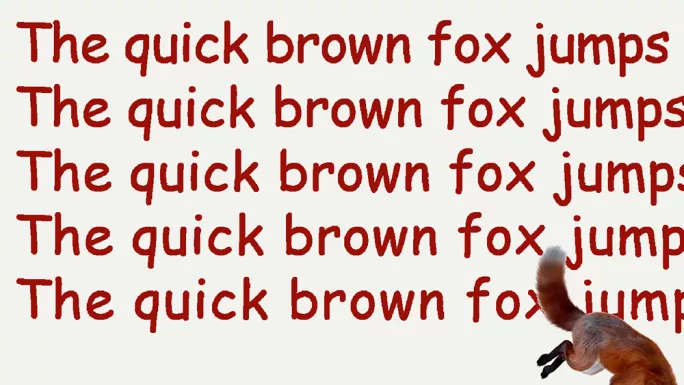
Write the same line in Comic Sans and in another font in MS Word, she says, one above the other, and the line in Comic Sans will usually stretch furthest along the page. It’s more spaced out, basically.
Hurrah, proof! Alas, not so fast.
That spacing is not a particular feature unique to Comic Sans, and those spacing benefits can be easily replicated in other fonts, more of which you will hear about a little later.
The actual font itself, that’s got no “serious” - to use Snowling’s term - research backing it up as being dyslexia-friendly at all.
In response to our survey, some teachers said they had already worked out for themselves that Comic Sans was not a miracle cure for struggling readers and students with dyslexia.
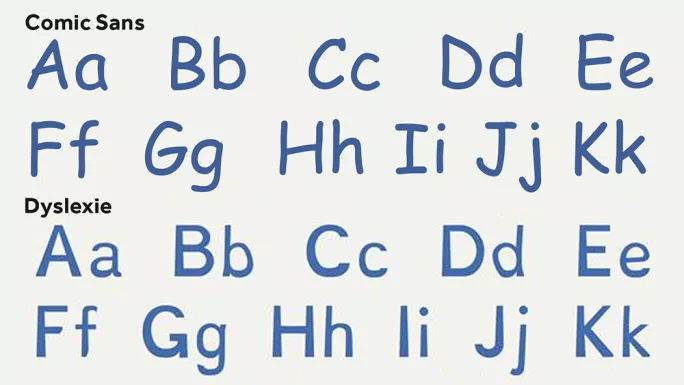
Many pointed out they were now using fonts specifically designed for dyslexic students instead, such as Dyslexie.
Hurrah, again! A replacement miracle cure!
Alas, again, not so fast. The evidence for the benefits of Dyslexie is also problematic.
The research cited by the Dyslexie font designers does suggest some benefits of use in terms of reduced error rate (of some error types) and “more efficient” comprehension, and some benefits when compared directly with a second font, such as Ariel. But the effects are small.
In addition, there have been plenty of other studies suggesting the effect of Dyslexie letter formations is minimal. One of those studies was by Eva Marinus.
“I would say that letter shape does not matter: children do equally well reading Arial and Dyslexie,” she explains. “The spacing settings of Dyslexie font seemed to give a slight advantage. In our study, we found an advantage of 7 per cent, which is not much. [And] it is possible to change overall spacing settings in MS Word. If you would like to apply the exact spacing settings of Dyslexie font, our free app can be used.”
She argues you can use that app and free up your font choice, saving you some cash. And she says several other papers support her own findings, including one published last year by Kuster et al, which found Dyslexie did not improve reading speed or accuracy, nor did children with dyslexia prefer it.
Robert Walder from Dyslexie responds that those behind the font welcome all research into its effectiveness, but he says the current literature is “inconclusive” because of both positive and negative findings.
He also questions the methodology of the Kuster et al study, particularly their choice of font size, chosen text and the adjustment of the Dyslexie spacing.
He adds that he hopes readers “are not discouraged to give Dyslexie font a try and judge for themselves (it’s free for home users)” and that ”Dyslexie font is not the solution for reading difficulties, but it is a tool that can help”.
“We absolutely agree that more extensive research is needed to determine the benefits of Dyslexie font scientifically,” he continues. “We are happy to help where needed. Until then, we know that the font is making a huge difference for many people and invite everyone to try and see for themselves.”
But what of the Marinus research?
He has not fully assessed it yet, he admits, but he says he is keen to learn more, as the finding of benefits around spacing “triggers our interest”.
You and me both, Robert.
So why might between letter and between word spacing make a difference, whereas font choice may not?
“It seems that at least for some people with dyslexia, they are vulnerable to a phenomenon called ‘visual crowding’ when they read, this is likely not the “cause” of their dyslexia but an exacerbating factor and something that has developed over years of struggling to read,” says Thompson.
“Crowding is an inability to distinguish closely packed visual information and so providing extra space between letters, or fonts that reduce the visual clutter (eg, sans-serif), can help mitigate this issue.”
Dr Holly Joseph, associate professor of Language Education and Literacy Development at the Institute of Education, University of Reading, has looked at this issue very recently.
She has been conducting experiments with Dyslexie using eye tracking software and her findings are intriguing not just in terms of why she believes Comic Sans and Dyslexie are not ‘better’ fonts, but in terms of how we read, too.
Here comes a long but very interesting quote, get comfy.
“When we read our eyes move in a series of saccades (jumps) and fixations (pauses) and it is during fixations that we extract the visual information we need to start identifying words and understanding them,” she explains.
“Most people look a little to the left of the centre of the word if we are reading fluently - which for most will be around the age of 7 - and they then see the immediate companion letters in their vision, and out from that the words get more ‘blurry’, if you can use that term. Hence, when we read, we are making guesses as to what the word is. So with the word ‘because’, you would focus on the ‘c’ and the ‘e’ will be right on the edge of your vision.
“Adults’ fixations are generally 180-200ms, and typically developing children’s (depending on their age) are closer to 250ms. Previous research has shown that children with dyslexia make longer fixations (perhaps 300ms depending on age and severity of dyslexia) and shorter saccades as they read, and this reflects their greater difficulty translating letters into sounds
“So if a special font were to work, we would expect to see fewer and shorter fixations in dyslexic readers when reading a dyslexic font than a standard font (all other things being equal).”
Her analyses of her data on the Dyslexie fonts is ongoing but she can say that what matters is not font, but - and I am aware this may be becoming repetitive, and I am not going to apologise for it - spacing between letters and between words.
“The spacing between the words is important as it provides information about where the next saccade (‘jump’) should be directed so it makes sense that fonts with extra space between words provide an additional clue to the oculomotor system about where to go next,” says Joseph. “However, it is less clear how other aspects of font design such as shape and weight might benefit readers.”
So there is agreement, of a sort, between the typographers and the dyslexia researchers: spacing, not letter shape, is key. However, all the researchers in this area stress more research is needed.
“My understanding of the literature is that it is still hard to draw strong conclusions and that effects of font tend to be small,” says Marinus. “More target experimental studies teasing out the effect of different aspects of font (eg, letter size, letter shape, different spacing settings) on reading outcomes (both accuracy and speed) are needed. Also, more research is needed on the effects of different groups (eg, beginning vs. more advanced readers, typical readers vs struggling readers)”
But what would they suggest teachers do when it comes to font choice based on the current research?
“If I was a teacher and I knew I had some struggling readers in my classroom, I’d probably do a quick user poll of a few more ‘spacious’ fonts - Arial, Comic Sans etc. and see what the consensus was,” says Thompson.
Marinus says she would not give it much thought at all.
“I wouldn’t worry too much about it, as the effects are so small,” she says. “I think teachers should mostly focus on appropriate teaching of reading, not too much on how the materials are presented.
“In general, I would stick to known fonts that children are familiar with. I would do a little bit of a literature review on the effects of letter size and spacing. For children with reading difficulties, I would offer the opportunity to read texts with enlarged spacing.”
Joseph agrees: “I think it is a concern if teachers and parents spend their own money on specialist fonts like Dyslexie when the studies are clear that it makes no difference - it does not hinder students but it does not help them, either.
“I think that teachers can get far too caught up in trying to create visual supports for dyslexic students - and I can see why an overlay or a font choice are appealing because they offer some quick solutions.
“The research says, though, that what really works is doing the long-term, everyday grind work of a high-quality, systematic phonics programme. I am under no illusion that such work is really hard to get right in a mainstream classroom under the time and budget constraints and with 30 children to teach.”
The big question of this article, then, has a clear answer: Comic Sans use should not be justified by claims of increased readability or benefits to dyslexic students or indeed for handwriting, but if you just like it, and your pupils like it, there is no good reason you should not use it. Or not use most other fonts for that matter. Font choice, it seems, is the least of your worries.
Yes, the tumblr haters may get on your back if you use Comic Sans, but who are they to judge? Be proud, if the kids like it, and you like it, then you should be allowed to shout “Fuck yeah, Comic Sans!” without fear (unless you are in school, of course).
Jon Severs is commissioning editor at Tes. He tweets @jon_severs
* I have used ‘font’ in the modern sense in this article, but I am aware that, technically, it should be typeface